Design Hero Poster
January 27, 2022

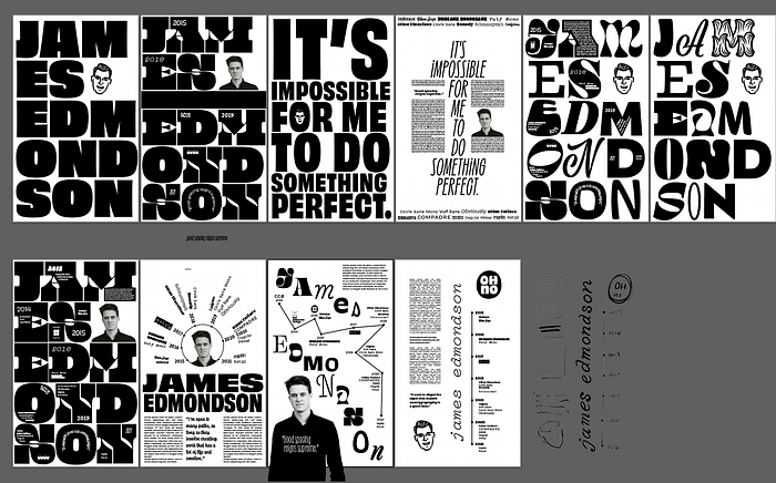
After doing some research and compiling a moodboard, I had some ideas for posters. Most of Edmondson’s work is done exclusively in black and white, and has a very heavy emphasis on funky typography. I wanted to emulate that in the posters.
I quickly found that of the three options (callout, timeline, or diagram), timeline made the most sense. It allowed me to showcase all of the typefaces James has designed at the same time, which helped my sketches to be less clunky.
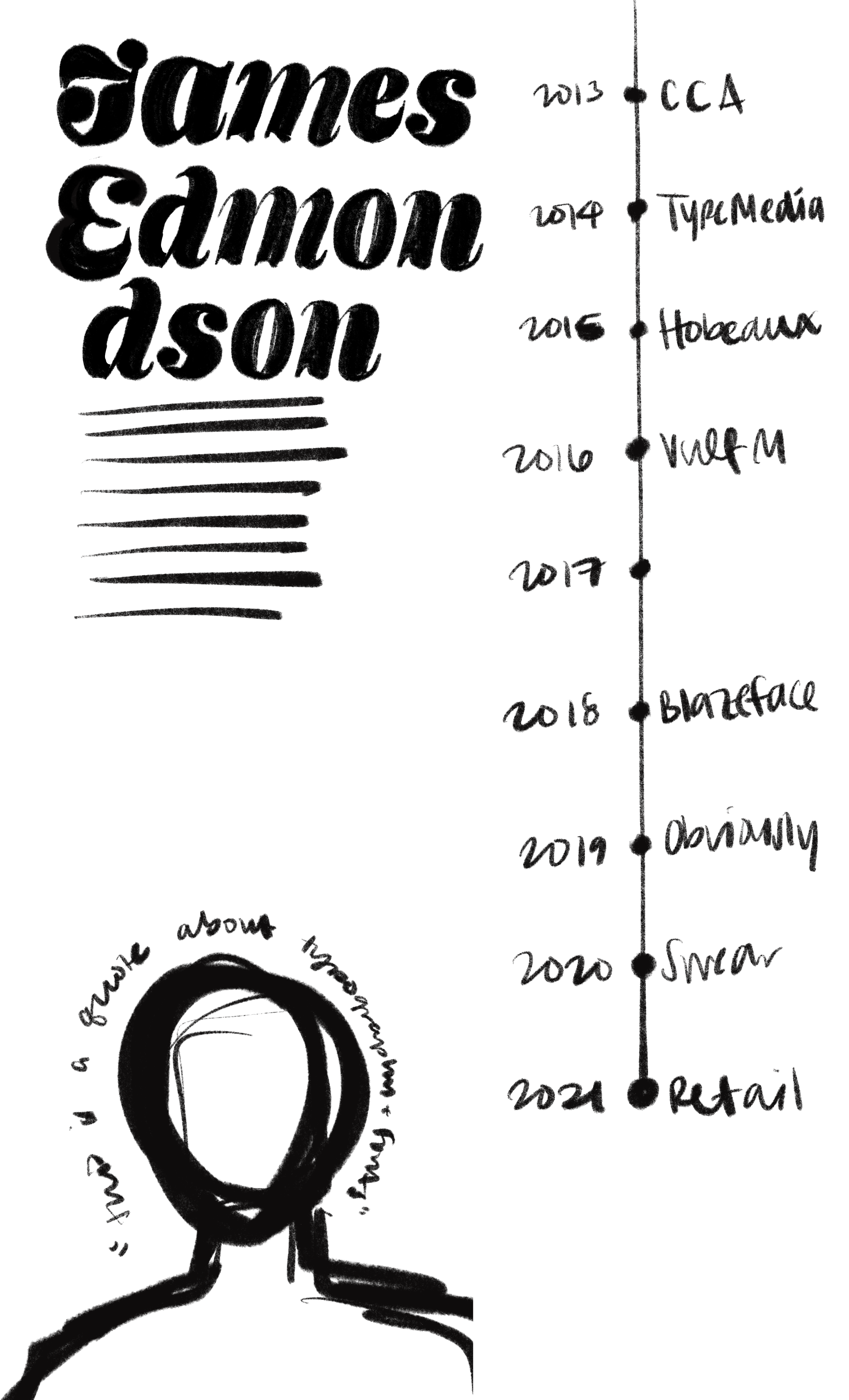


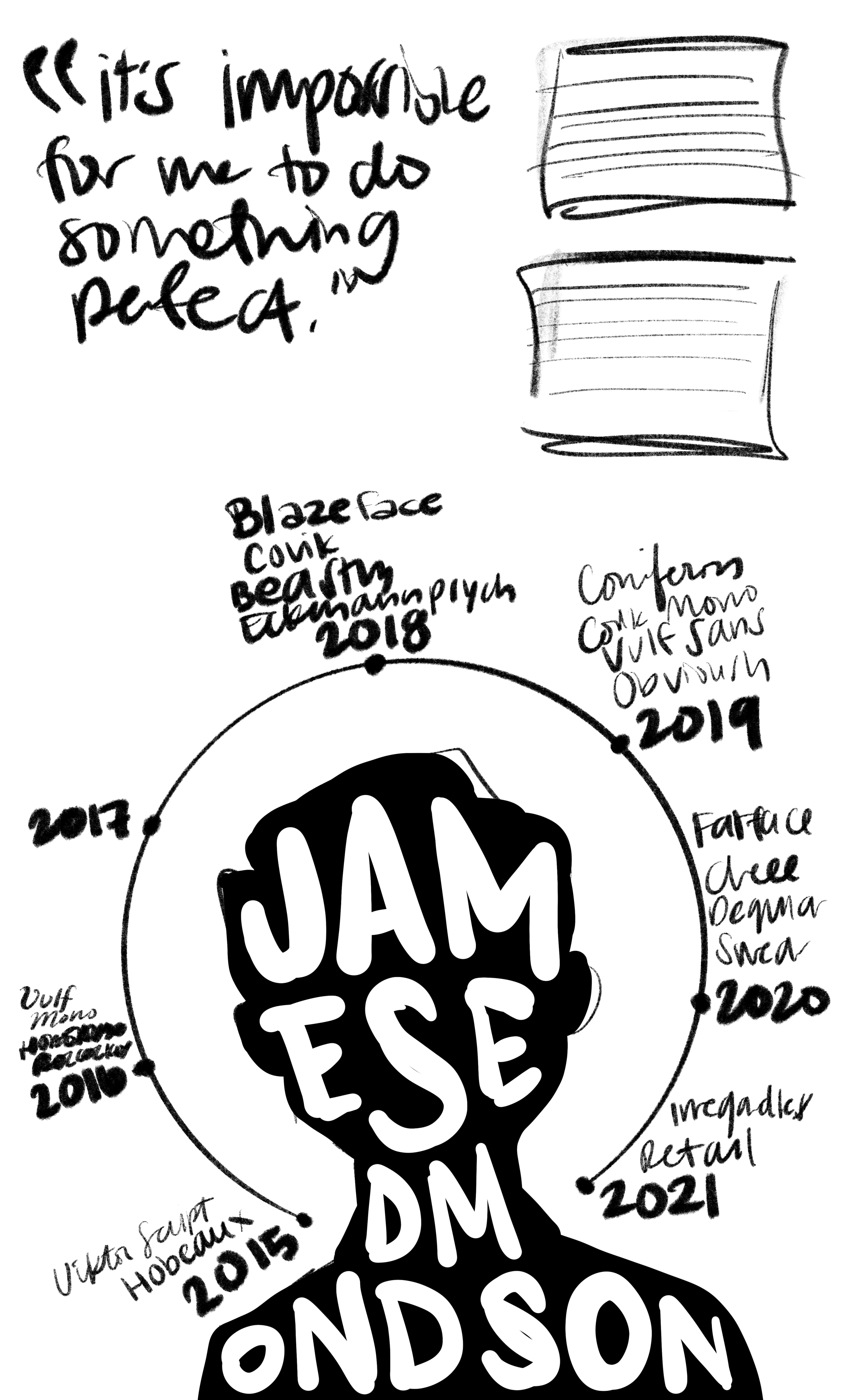

I often find that I’ll stick to my first idea, or one of my first few ideas. I actually really enjoyed the exercise of having to make 10 sketches—I think it forced me to think further outside the box than I normally do. Without the 10 sketches requirement, I wouldn’t have come up with the idea to make the timeline a circle. I’m not sure I’ll keep it, of course, but it’s definitely more fun and interesting than a linear timeline. Of course, any of these could be inverted (black background/white text); it was easier when sketching to use a white background for all of them.
Some things I explored during the sketching process:
- Name as main text vs. quote as main text
- Portrait modifications: upside down, silhouetted, inside the “O” in his name, etc
- Callouts vs timelines (wasn’t sure how to incorporate a diagram into these with his work)
- Title alignment & placement (top, bottom, middle; centered, left-aligned, right-aligned, etc)
My favorite posters are these ones.


Things I want to keep exploring:
- Edmondson has added a bunch of icons into many of his fonts as extra characters. I’d be interested to see what I could do with that
- Potentially creating a pattern out of some of his glyphs
- Alternate ways to show off his typefaces beyond a timeline list
February 7, 2022
For tomorrow’s class, I cleaned up and refined two of these posters.
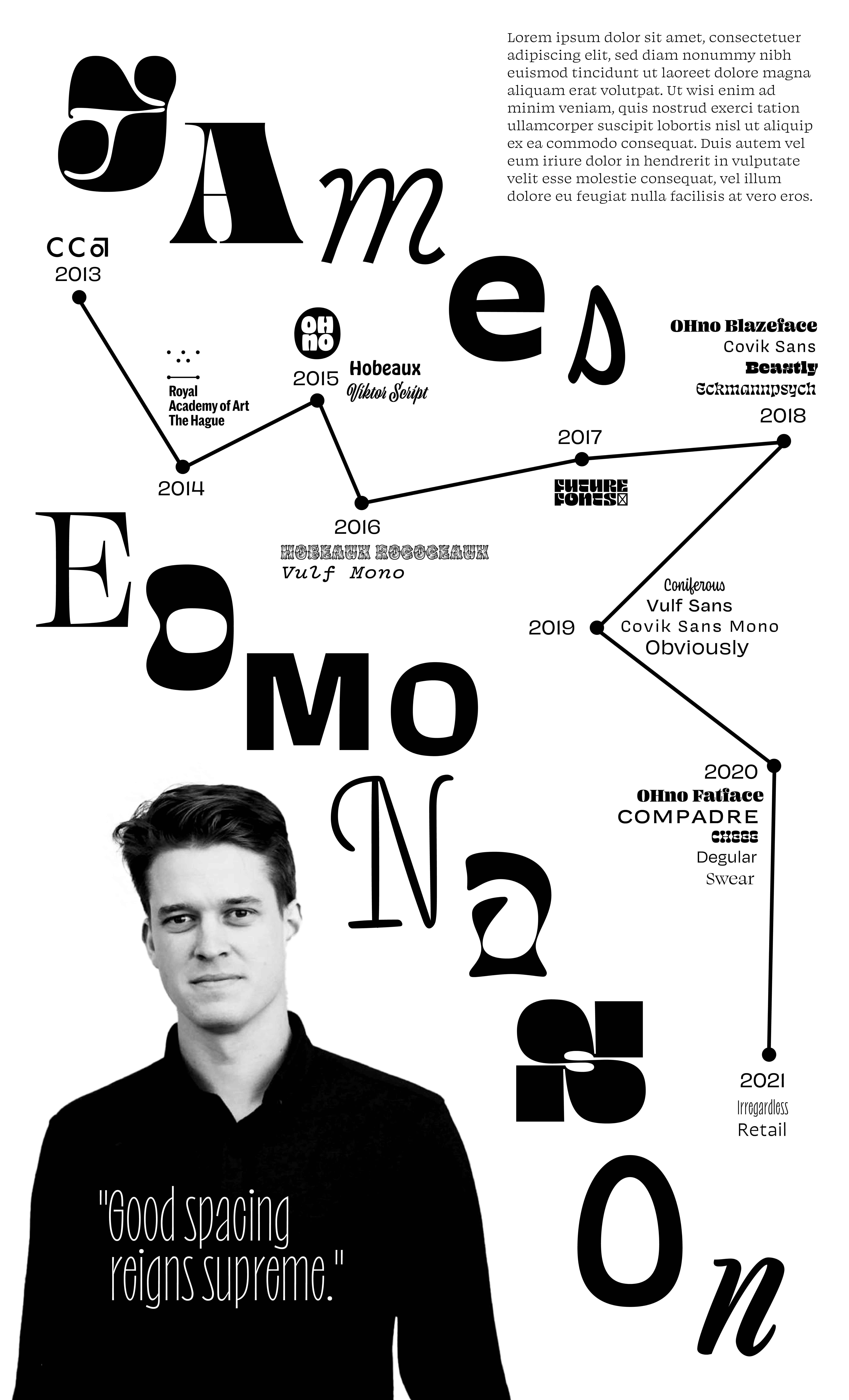
There wasn’t a lot I changed from my sketches for these; it was mostly about translating them to vector & tightening up the layout. During class, it seemed like everyone was drawn to the one on the right (which I agreed with). I did have to actually alter some of the letterforms to make them fit, but I think it worked okay without taking away any of the feeling of the original typeface.
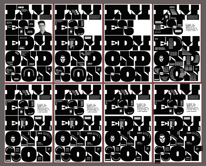
I ended up making a lot of different variations before arriving at the finals I included above. I tried making refined versions of quite a few of my sketches, which made it clear that many of these posters would work better as a page in a book or magazine rather than a large-scale poster.
I tried taking some suggestions that my classmates & TAs made—the third poster in the first row was a suggestion from someone (combining a couple of my sketches), but I don’t think it ended up working. Maybe if I actually had the variable font instead of the 96 styles, it would have worked better. The last two in the top row were an attempt to combine the two ideas that I ended up bringing to class, but they also didn’t quite work right. I still like the concept, though, so maybe I’ll bring it back for one of our other projects this semester.
February 9, 2022
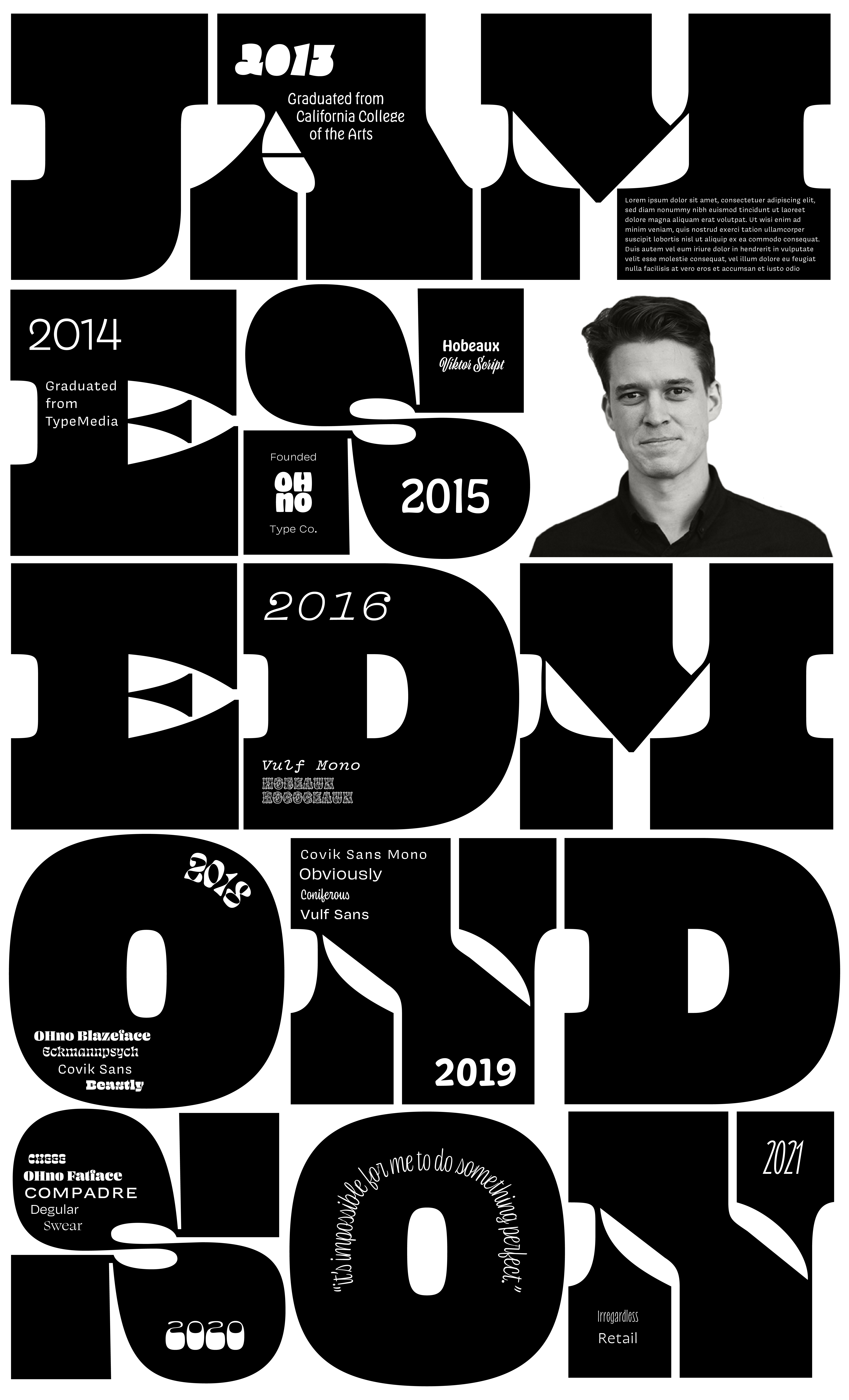
After hearing feedback in class on Tuesday, I decided to move the portrait to inside the “O”. I used a vector illustration of James that he included as a bonus glyph in one of his fonts, and I put the quote where the portrait had been previously. I also tightened up all the type, getting rid of the spaces between letters and eventually between lines to try to break up the grid a little. Speaking of which, I also cleaned up the grid some and made my letterforms meet each other more nicely.
I also rearranged the timeline/typeface text to try to be a little more interesting. I tried one version where I showed all the styles of each typeface, but it felt like way too much.

I talked to some of my classmates, who thought I should fill the space with the quote more, so I tried having it larger and bolder. I wasn’t sure whether I wanted to keep the letters separate or get rid of the spacing between them, so I kept both versions. I also wasn’t sure about having text go beyond the edges of the poster, so I added a version with that too.
Then I talked to Brett, who suggested that I replace the vector portrait with a real photo. He also said that the quote worked better smaller, which I agreed with but until that point wasn’t sure if that was just me.
He wanted the internal type to be more interesting, so I decided to add in a couple of the type style lists that I had done in my earlier refinements. But instead of doing it for every font with styles, I only did it in a few places.


I’m still not sure about the extended letters, so I’m bringing both to class tomorrow.
February 11, 2022
After getting some feedback in class, I decided to rework the inner text a bit. I rearranged the 2020 fonts and made all of the font names smaller. I also justified my body copy and made the text box narrower, as well as made the quote smaller.
I also liked Yoshi’s idea of keeping the extended serifs only as an entry/exit point, so I added that as well as gave the entire poster (aside from the extended serifs) a wider margin.
I’m not sure where this next idea came from—possibly from looking at Elise’s poster and wanting to invert the colors of Emil Ruder’s silhouette? Or maybe because I realized I was the only person in the class working exclusively in black and white? Either way, I decided to see what it would look like if I inverted the colors.
For some reason, this works way better than the older version. I asked some of my classmates and they all agreed unanimously that white on black was better than black on white.


I decided to make the years the same size as the font names. But I still wasn’t sold on the point size of the timeline and information, so I ended up making three different versions—one in 18pt, one in 21pt, and one in 24pt. The 21pt version was the clear winner.


After this, I moved the body copy to a different place on the M that was a better size. Then I re-edited the portrait (changing things like contrast and brightness) to try to find the right balance. I changed the color mode to true grayscale and used the curves to darken up the darker parts of the image a little bit.
I’m feeling really, really good! I think in class yesterday I felt pretty good about my poster, but now I can say that I’m proud of it and genuinely excited about it, which is always a nice feeling. :)
